Moving Average Convergence Divergence (MACD)
Moving Average Convergence Divergence (MACD)
Education

A standard tool used to determine trends in the market is the Moving Average (MA). It has been observed that two MAs provide better insight into the market than one. Using two MAs leads to the natural question of the distance between them. The MACD is the answer to this question. It is essential to understand the MACD as I will be referencing it in my analysis of the SP500.
Let’s start with the MACD’s three components and how they are calculated. We will use the standard MACD that comes with most trading platforms. All components are computed from two EMAs of the base instrument. These EMAs are referred to as the Fast EMA and Slow EMA. Fast EMA means that it is a smaller period than Slow EMA. Traditionally 12 is used as the period for the Fast EMA and 26 for the Slow EMA. The first component calculated using these two inputs is the MACD Line. To calculate the MACD Line, we use the (Fast EMA - Slow EMA). This value can be either positive or negative, depending on whether the Fast EMA is greater or less than the Slow EMA. The second component we calculate is called the Signal Line. The Signal Line is calculated by taking an EMA of the MACD Line. Traditionally, the period for this EMA is 9. The third and final component of the MACD is the Histogram. Similar to how the Signal Line is calculated, the Histogram is calculated by subtracting the MACD Line from the Signal Line (MACD Line - Signal Line). These three components are plotted on a chart above or below the base instrument.
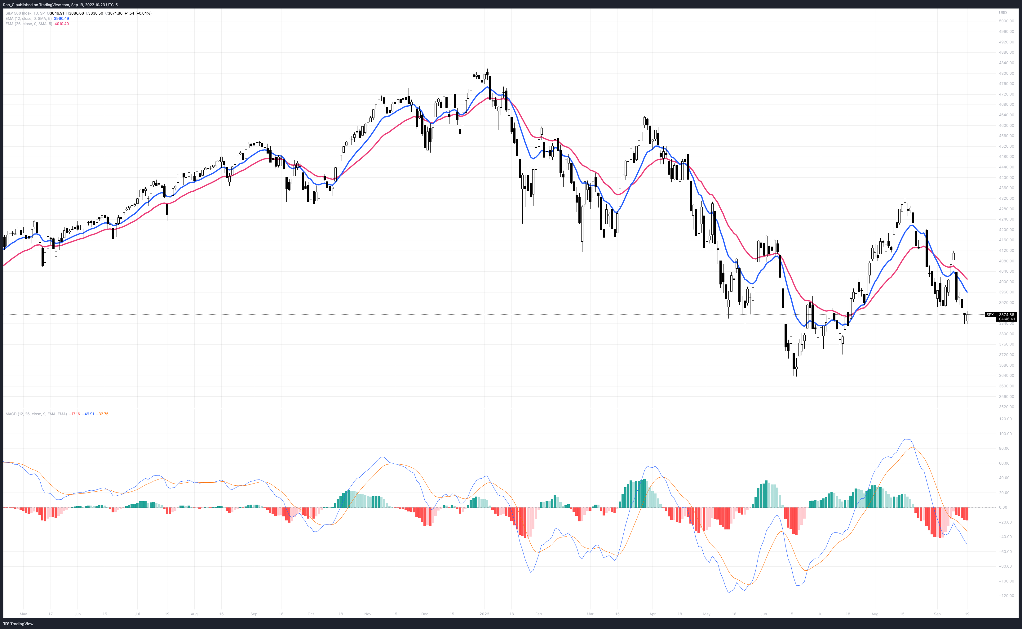
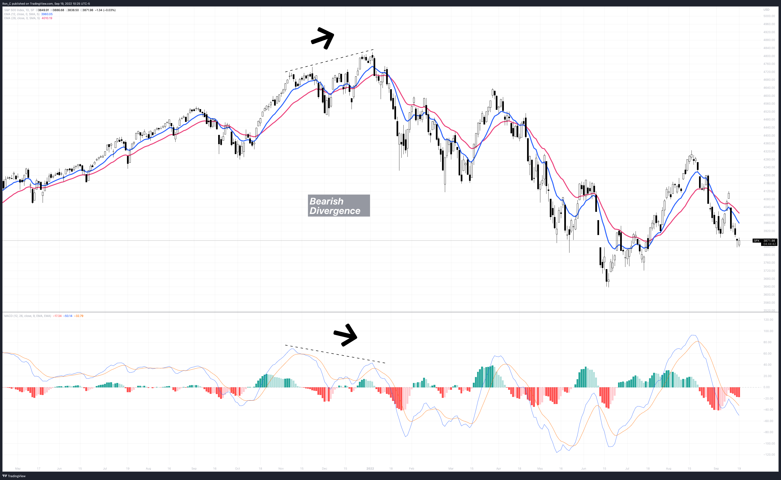
After calculating the three components and plotting them, we need to understand what they are telling us. To be clear, no perfect combination of MACD components will result in windfall profits. Instead, the components give us an insight into the underlying instrument's overall trend. Starting with the MACD Line, this is simply an unbounded oscillator that tells us the difference between our two EMAs. We can use this to look for bearish and bullish divergences between the MACD Line and the price action on the chart. The Signal Line is a smoothed version of the MACD Line, which provides insight into whether the distance is, on average, growing between the two EMAs. A bull trend in the price and upward pointing Signal Line can signal strength in the trend. Whereas a bull trend in price and declining Singal Line could be a warning that the trend will not be sustained. The Histogram provides the same information about the MACD Line and Signal Line that the MACD Line gives us about the Fast EMA and Slow EMA. Being in a different format prevents it from getting lost in the noise and makes the indicator easier to read. The Histogram can be used to find divergences or confirmations in the trend of the MACD Line.
Understanding the basics of the MACD ensures you understand what it is telling you when using the indicator. Continued use of the indicator will help spot divergences and understand its subtleties. There is no replacement for experience.
To read more about the MACD check it out on Investopedia.